Exercises
In this section, you will find the R code that we will use during the course. We will explain the code and output during correction of the exercises.
Source of data
We will work with RNA sequencing data generated by Ercolano et al 2020. This study described the transcriptomes of immune cells that are circulating in the blood of humans in healthy conditions. Different types of immune cells circulate in human blood. In this study, 2 cell types were included: Natural Killer (NK) cells and CD4+ T helper (Th) cells. These 2 types of cells have different functions: NK cells provide a rapid response in the innate immune response at the beginning of an infection such as by a virus, and are able to kill virus-infected cells by secreting cytotoxic molecules; Th cells have an important role in the adaptive immune response by aiding antigen-presenting cells by secreting different panels of cytokines depending on the type of pathogen infecting the host. Here we perform enrichment analysis using the genes that are differentially expressed between NK cells and Th cells.
The RNA sequencing data that we provide includes the results of a differential gene expression analysis comparing NK cells to Th cells. The differential gene expression analysis was performed using limma (see Useful links page).
Before starting the exercises, set the working directory to where you have downloaded and unzipped the data folder with the files for the exercises and load the necessary packages. Also, set the seed so that results are replicable.
Warning
When using setwd(), change the path within quotes to where you have saved the data for the exercises
# Change the path here:
setwd("/path/to/whereDataFolderIsSaved/")

library(clusterProfiler)
library(enrichplot)
library(pathview)
library(org.Hs.eg.db)
library(ggplot2)
library(ggrepel)
library(msigdbr)

library(tidyverse) # for bonus code/dplyr/pipe

# set seed
set.seed(1234)
Exercise 1 - Over-representation analysis
Import the data into your R session and explore its structure: what are the different columns corresponding to? How can you search for a particular gene within this table?
# Import DE table:
NK_vs_Th<-read.csv("data/NK_vs_Th_diff_gene_exercise_1.csv",
                   header = T)

# Look at the structure of the data.frame:
head(NK_vs_Th)

# Search for a gene symbol in the data.frame, eg NCAM1 (CD56)
NK_vs_Th[which(NK_vs_Th$symbol=="NCAM1"),]
This table contains the typical information obtained after differential gene expression analysis. For each gene, you have log2 fold change values and significance information via the raw p-value and adjusted p-value. A positive log2 fold change value indicates that the gene is more expressed in NK cells than in Th cells, while a negative log2 fold change value indicates that the gene is less expressed in NK cells than in Th cells. The p-value is usually computed automatically by R packages designed for differential gene expression analysis such as edgeR, limma or DESeq2. If you ever need to perform p-value adjustment, there is a function that is part of the stats package called p.adjust(), that allows you to perform p-value adjustment for any list of p-values. Look at the help of the function and try to understand the arguments that can be used.
?p.adjust
We can compare the raw p-value and adjusted p-value for any gene. Raw p-values that are close to 0.05 will often become higher than 0.05 after adjustment, while very small p-values more likely remain below 0.05 after adjustment. Search for 2 genes in the data.frame, CPS1 and GZMB, and verify the effect of adjustment on their p-values. Are both genes still significant after adjustment?
Answer
NK_vs_Th[which(NK_vs_Th$symbol=="CPS1"),]

NK_vs_Th[which(NK_vs_Th$symbol=="GZMB"),]
If we expect a particular group (or set) of genes to be altered between 2 conditions, we can specifically test for this using a single Fisher test, i.e an over-representation analysis. Here, because we compared cells that are involved in the innate immune response (NK cells) to cells involved in the adaptive immune response (Th cells), we expect that there are differences in genes involved in the adaptive immune response. Which direction do you think the adaptive immune response genes should have? Rather up-regulated in NK or down-regulated in NK vs Th cells?
As you will see later in the course, there are databases available where you can obtain gene sets. We have obtained the Gene Ontology adaptive immune response gene set from the MSigDB resource. Import the list of genes included in this gene set, and determine, using a Fisher test, whether the genes up-regulated in Th cells (i.e. down-regulated in NK cells) are enriched in the adaptive immune response.
# Import the adaptive immune response gene set (gmt file)
adaptive<-clusterProfiler::read.gmt("data/GOBP_ADAPTIVE_IMMUNE_RESPONSE.v7.5.1.gmt")
nrow(adaptive) # 719
View(adaptive)
RNA sequencing analysis often involves filtering genes to remove lowly expressed genes. Therefore, it is possible that not all genes that are part of a gene set are found in your RNA seq dataset. Check how many genes in the RNA-seq data set are found in the adaptive immune response gene set.
length(which(NK_vs_Th$symbol %in% adaptive$gene)) # 513
To perform a Fisher’s exact test, we need to build a contingency table of the number of genes that are up-regulated or not significant in Th cells, and that are part or not of the gene set of interest. First, count the number of genes up-regulated in Th cells (i.e. down-regulated in NK cells), then the number of not significant genes, then determine for each type of genes whether they are part of the adaptive immune response gene set or not.
Answer
# Extract the number of genes up-regulated in Th (i.e. down-regulated in NK):
Th_up<-subset(NK_vs_Th,
NK_vs_Th$p.adj<=0.05&NK_vs_Th$logFC<0)
# Are these genes part of the gene set?
summary(Th_up$symbol %in% adaptive$gene)
#    Mode   FALSE    TRUE
# logical    1753     142
table(Th_up$symbol %in% adaptive$gene)

# Extract the number of not significant genes:
Th_not_DE<-subset(NK_vs_Th, NK_vs_Th$p.adj>0.05)
# Are these genes part of the gene set?
summary(Th_not_DE$symbol %in% adaptive$gene)
#    Mode   FALSE    TRUE
# logical   16344     289
Next, build a contingency table that has the following format:
| Up-reg. | Not up-reg. | |
|---|---|---|
| In gene set | # | # |
| Not in gene set | # | # |
Finally, use the fisher.test() function to determine whether the adaptive immune response is over-represented among the genes up-regulated in Th cells. If you don’t know how to use the `fisher.test() function, remember to use the help:
?fisher.test()
Answer
# There are several ways to build the contigency table:
# 1: by hand:
cont.table<-matrix(c(142, 1753, 289, 16344), ncol=2,byrow = F)
cont.table

# 2: by using the individual values of the table() function:
cont.table<-matrix(c(unlist(table(Th_up$symbol %in% adaptive$gene))[[2]],
unlist(table(Th_up$symbol %in% adaptive$gene))[[1]],
unlist(table(Th_not_DE$symbol %in% adaptive$gene))[[2]],
unlist(table(Th_not_DE$symbol %in% adaptive$gene))[[1]]),
ncol=2, byrow = F)
cont.table

# 3: by using the 2 rows (reversed) of the table() function:
cont.table<-matrix(c(rev(unlist(table(Th_up$symbol %in% adaptive$gene))),
rev(unlist(table(Th_not_DE$symbol %in% adaptive$gene)))),
ncol=2, byrow = F)
cont.table

# Add row and colum names so that you know what each number corresponds to:
colnames(cont.table)<-c("up", "not_up")
rownames(cont.table)<-c("in_set", "not_in_set")
cont.table
#              up   not_up
# in_set      142      289
# not_in_set 1753    16344

# Compare the proportions:
142/(142+1753)
289/(289+16344)

# Run fisher test:
fisher.test(cont.table)
# Fisher's Exact Test for Count Data
# data:  cont.table
# p-value < 2.2e-16
# alternative hypothesis: true odds ratio is not equal to 1
# 95 percent confidence interval:
#  3.697701 5.654348
# sample estimates:
# odds ratio
#   4.580549
In case you wish to run an over-representation analysis for several gene sets at once, instead of running several independent Fisher tests, you can use the enricher() function of the clusterProfiler package. This function allows you to perform an over-representation analysis of several gene sets at once, using an implementation of the hypergeometric test (a one-sided Fisher’s exact test).
Check out the help of the function: What arguments do you need to provide?
Determine whether the genes up-regulated in NK cells are over-represented in 3 gene sets: the adaptive immune response gene set used above, another related to cell activation, and one un-related to immune cells (hair cell differentiation).
# Help: hypergeometric test (like one-sided Fisher test = greater)
?enricher()

# Test 3 gene sets among the genes up-regulated in NK cells,
# with enricher()
# First, obtain the genes up-regulated in NK:

nk_up_genes<-subset(NK_vs_Th, NK_vs_Th$logFC>0&NK_vs_Th$p.adj<=0.05)$symbol

# Import 2 other gene sets, 1 un-related to immune cells:
hair<-read.gmt("data/GOBP_HAIR_CELL_DIFFERENTIATION.v7.5.1.gmt")
dim(hair)
cell_active<-read.gmt("data/GOBP_CELL_ACTIVATION.v7.5.1.gmt")
dim(cell_active)

# Combine the 3 gene sets into a single data.frame for the TERM2GENE argument:
genesets3<-rbind(adaptive, hair, cell_active)

hyper_3genesets<-enricher(gene=nk_up_genes,
                      universe = NK_vs_Th$symbol,
                      TERM2GENE = genesets3,
                      maxGSSize = 1000)
View(hyper_3genesets@result)
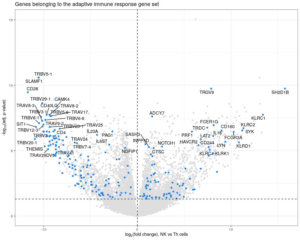
Bonus How would you represent the over-representation result for the adaptive immune response? An option might be a volcano plot coloring genes that are part of the gene set and significant using ggplot2.
library(ggplot2)
library(ggrepel)

sig_genes<-subset(NK_vs_Th, NK_vs_Th$symbol %in% adaptive$gene & NK_vs_Th$p.adj<=0.05)
sig_genes_label<-subset(sig_genes, sig_genes$p.adj<=0.00001)

ggplot(NK_vs_Th, aes(x = logFC,  #
                     y = -log10(p.adj))) +
        geom_point(color="grey87")  +
        ggtitle("Genes belonging to the adaptive immune response gene set") +
        theme_bw() +
        geom_text_repel(data = sig_genes_label,
                        aes(x=logFC,
                            y=-log10(p.adj),label=symbol),
                        max.overlaps = 20) +
        geom_point(data=sig_genes, col="dodgerblue2") +
        theme(legend.position = "none") +
        scale_x_continuous(name = expression("log"[2]*"(fold change), NK vs Th cells")) +
        scale_y_continuous(name = expression("-"*"log"[10]*"(adj. p-value)")) +
        geom_hline(yintercept = -log10(0.05), linetype="dashed") +
        geom_vline(xintercept = 0, linetype="dashed")
Exercise 2 - Gene set enrichment analysis (GSEA)
Next, we will use functions of the clusterProfiler package to perform a gene set enrichment analysis (GSEA) of Gene Ontology terms. For this, we first need to create a vector with the t-statistic of each gene, assign the gene symbol to each t-statistic in the vector (i.e. names), then sort the vector.
Warning
A single gene can be labeled with different types of gene labels: Ensembl IDs, NCBI Entrez IDs, gene symbols, UniProt IDs, etc. Therefore, first check whether the way the genes are labeled is supported by clusterProfiler using:
idType(OrgDb = "org.Hs.eg.db") # to determine allowed gene id type
Create the named and sorted vector of t-statistics (i.e. for the geneList argument of the gseGO() function).
gl<-NK_vs_Th$t
names(gl)<-make.names(NK_vs_Th$symbol, unique = T)
gl<-gl[order(gl, decreasing = T)]

GO_NK_Th<-gseGO(gl, ont="BP",
                OrgDb = org.Hs.eg.db,
                keyType = "SYMBOL",
                minGSSize=30,
                eps=0,
                seed=T)
Explore the new object that was created. What is its structure? What does it contain? Is the adaptive immune response gene set significant? How many gene sets are down- or up-regulated?
Answer
    class(GO_NK_Th)
    str(GO_NK_Th)
    View(GO_NK_Th@result)

    GO_NK_Th@result[GO_NK_Th@result$Description=="adaptive immune response",]
    summary(GO_NK_Th@result$p.adjust<0.05&GO_NK_Th@result$NES<0)
  # Mode     FALSE    TRUE
  # logical    320      63

  summary(GO_NK_Th@result$p.adjust<0.05&GO_NK_Th@result$NES>0)
  #     Mode   FALSE    TRUE
  # logical       63     320
Among the results, some gene sets seem to be a bit redundant based on the genes they contain (column “core_enrichment”). We can simplify the results by using the simplify() function of the clusterProfiler package:
# Simplify:
?clusterProfiler::simplify
GO_NK_Th_simplify <- clusterProfiler::simplify(GO_NK_Th)
View(GO_NK_Th_simplify@result)
GO_NK_Th_simplify@result[GO_NK_Th_simplify@result$Description=="adaptive immune response",]
@result by using the slash. And if you want to obtain a full list
of genes belonging to a particular GO term, this information is also stored in the @geneSets slot.
# Export results
write.csv(GO_NK_Th@result, "GO_GSEA_NK_vs_Th.csv",
          row.names = F, quote = F)

# How to obtain the list of leading edge genes for a gene set:
unlist(strsplit(GO_NK_Th@result[GO_NK_Th@result$Description=="adaptive immune response",11],
                "\\/"))

# How to obtain the list of all genes included in a GO term:
GO_NK_Th@geneSets$`GO:0002250`
As you will see later in the course, objects of type enrichResult or gseaResult generated by clusterProfiler functions can be used directly in some visualization functions. Therefore, you could save your full output object also to allow for easy visualization later.
# export full object
saveRDS(GO_NK_Th, "GO_NK_Th.rds")

# import a saved object:
GO_NK_Th<-readRDS("GO_NK_Th.rds")
Bonus In the context of single-cell RNA sequencing data for example, single-cells are clustered, and marker genes per cluster are obtained. In this case, we
don’t always obtain a t-statistic or fold change value for every gene in the dataset, but rather a simple list of significant genes. With this list,
you can perform an over-representation analysis of the GO terms using enrichGO(). The output will not contain enrichment scores, but rather p-values for
every gene set.
nk_up_genes<-subset(NK_vs_Th, NK_vs_Th$logFC>0&NK_vs_Th$p.adj<=0.05)$symbol

# Provide list of significant genes for over-representation analysis of GO gene sets
# using enrichGO():
GO_enrich<-enrichGO(gene=nk_up_genes,
                    OrgDb = org.Hs.eg.db,
                    keyType = "SYMBOL",
                    # ont="BP",
                    ont="MF", # ont="MF" is the default
                    minGSSize = 30,
 universe=NK_vs_Th$symbol) # may bug with barplot below if added, depending on version
View(GO_enrich@result)

# Check the class of the objects created:
class(GO_enrich)
# [1] "enrichResult"
# attr(,"package")
# [1] "DOSE"
class(GO_NK_Th)
# [1] "gseaResult"
# attr(,"package")
# [1] "DOSE"
This method can also be used if you have a list of genes involved in a disease, such as genes that are mutated in cancer, or lists of genes obtained by other omics methods, such as genes that have a transcription factor binding site in their promoter (ChIP-seq), etc.
Exercise 3 - Visualization of enrichment results
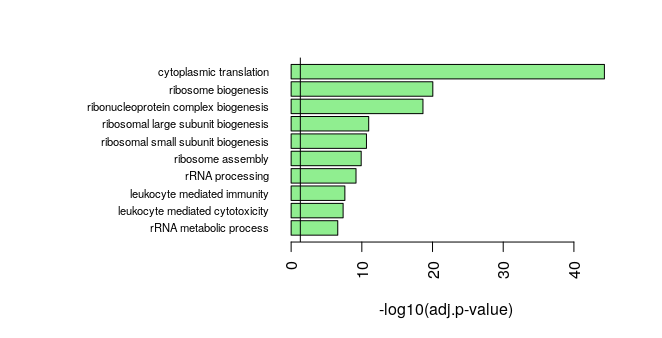
Once we have performed a GSEA or over-representation analysis, we need of course to show the results and prepare figures for a publication. Several visualizations are possible. The first option is a barplot. It can be a barplot of p-values of top over-represented GO terms. P-values are usually -log10-transformed, so that the very small p-values are emphasized compared to p-values that are closer to 0.05. The barplot() function comes from the graphics package.
par(mar=c(5,20,3,3))
barplot(rev(-log10(GO_NK_Th@result$p.adjust[1:10])),
        horiz = T, names=rev(GO_NK_Th@result$Description[1:10]),
        las=2, xlab="-log10(adj.p-value)",
        cex.names = 0.7,
        col="lightgreen")
abline(v=-log10(0.05))
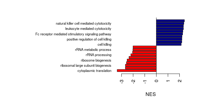
In publications, we often see barplots of normalized enrichment scores (NES), showing which gene sets are up-regulated and which are down-regulated.
Now that you know how to use the barplot() function, how would you create a barplot of NES of the top 10 up-regulated and the top 10 down-regulated genes sets,
with red bars for the up-regulated gene sets and blue bars for the down-regulated gene sets?
Answer
    # Barplot of NES of the top GO gene sets, with different color for up- or down-reg gene sets:
    sorted_GO_NK_Th<- GO_NK_Th@result[order(GO_NK_Th@result$NES, decreasing = F),]
    sorted_GO_NK_Th$color<-ifelse(sorted_GO_NK_Th$NES<0, "red", "darkblue")

    par(mar=c(5,20,3,3))
    barplot(sorted_GO_NK_Th$NES[c(1:10, (nrow(sorted_GO_NK_Th)-9):nrow(sorted_GO_NK_Th))],
        horiz = T, names=sorted_GO_NK_Th$Description[c(1:10, (nrow(sorted_GO_NK_Th)-9):nrow(sorted_GO_NK_Th))],
        las=2, xlab="NES",
        cex.names = 0.7,
        col=sorted_GO_NK_Th$color[c(1:10, (nrow(sorted_GO_NK_Th)-9):nrow(sorted_GO_NK_Th))])
    abline(v=0)
With results of an over-representation analysis, where the output is of class enrichResult, the barplot() function can be used directly. You can either show the significant gene sets, or a custom selection of them.
# Use the GO_enrich analysis performed above, of the over-representation analysis
# of genes up-regulated in NK cells:
# barplot() can be directly used on enrichResult objects: but not on gseaResult objects
graphics::barplot(GO_enrich)
graphics::barplot(GO_enrich, color = "qvalue", x = "GeneRatio")

graphics::barplot(GO_NK_Th) # this is a gseaResult object
# Error in barplot.default(GO_NK_Th) :
# 'height' must be a vector or a matrix

# Select only 2 out of the significant gene sets:
ego_selection = GO_enrich[GO_enrich@result$ID == "GO:0042287" | GO_enrich@result$ID == "GO:0004713", asis=T]
barplot(ego_selection)
Here, we used the barplot function of the graphics package, but you can of course use ggplot2 functions. Please see the Bonus code page for examples of barplots with ggplot2 (and tidyverse) functions.
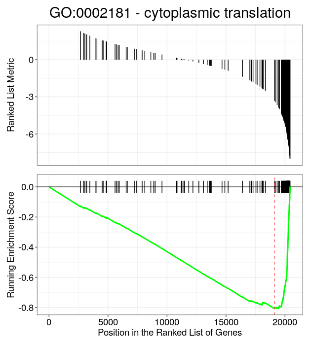
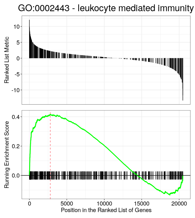
A common way to represent the enrichment score of a single gene set after GSEA is the barcode plot (i.e gsea plot), with the gseaplot() function that can be used directly on objects of class gseaResult (i.e. output by clusterProfiler functions).
# Barcode plot
# You need the ID of the GO gene set to plot:
GO_NK_Th@result[1:10,1:6]

# For a gene set that is down-regulated in NK cells:
gseaplot(GO_NK_Th, geneSetID = "GO:0002181",
         title="GO:0002181 - cytoplasmic translation")
# And one that is up-regulated in NK cells
gseaplot(GO_NK_Th, geneSetID = "GO:0002443",
         title="GO:0002443 - leukocyte mediated immunity")
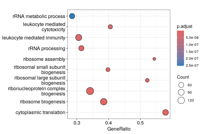
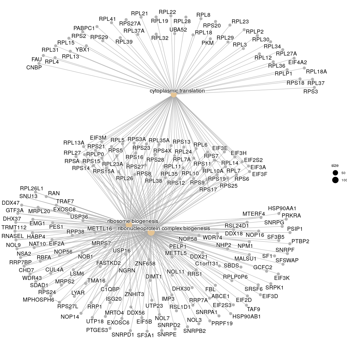
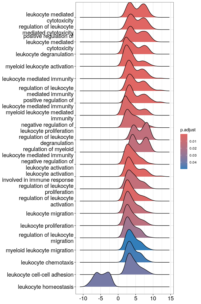
Finally, clusterProfiler provides several visualization methods that can be used directly on objects of class “gseaResult” or “enrichResult. These functions are implemented in the enrichplot package that was developped to go with clusterProfiler. Examples are the dotplot, the gene-concept network (cnetplot), the enrichment map (emapplot) and the ridge plots. Feel free to consult the chapter on visualization of the nice clusterProfiler book to see all the possible options and test others than the ones listed here!
# Dotplot on enrichResult and gseaResult objects:
enrichplot::dotplot(GO_enrich, orderBy="p.adjust")
enrichplot::dotplot(GO_NK_Th, orderBy="p.adjust")
# Gene concept network:
cnetplot(GO_enrich, categorySize="pvalue")
cnetplot(GO_NK_Th, showCategory = 3)
# The enrichment map:
ego2 <- pairwise_termsim(GO_NK_Th)
emapplot(ego2, color="p.adjust")

# The ridge plots:
# Distribution of t-statistic for genes included in significant gene sets or in selected gene sets:
ridgeplot(GO_NK_Th)
# What is the difference with core_enrichment =F?
ridgeplot(GO_NK_Th, core_enrichment = F)

# Select which GO terms to show in the ridge plot:
GO_NK_Th_selection <- GO_NK_Th[GO_NK_Th$ID == "GO:0002181", asis=T]
ridgeplot(GO_NK_Th_selection)
GO_NK_Th_selection <- GO_NK_Th[GO_NK_Th$ID %in% c("GO:0002181","GO:0022613",
                                                  "GO:0042254"),
                                                  asis=T]
ridgeplot(GO_NK_Th_selection)
# Terms that contain the keyword "leukocyte"
GO_NK_Th_selection <- GO_NK_Th[grep("leukocyte",GO_NK_Th@result$Description), asis=T]
ridgeplot(GO_NK_Th_selection)
Please see the Bonus code page for an example of a lollipop plot with ggplot2.
Exercise 4 (the last one!) - Enrichment of other collections of gene sets
We will now perform GSEA of other collections of gene sets, such as KEGG or Hallmark. For GSEA of the KEGG gene sets, the gene IDs have to be NCBI Entrez gene IDs. ClusterProfiler provides the bitr() function to convert gene label types.
keytypes(org.Hs.eg.db)
# convert from= "ENSEMBL" to "SYMBOL" and "ENTREZID"
gene_convert <- bitr(as.character(NK_vs_Th$ensembl_gene_id),
                     fromType="ENSEMBL",
                     toType=c("SYMBOL", "ENTREZID"), OrgDb="org.Hs.eg.db")

# Check the format of the data frame obtained after conversion:
head(gene_convert)
dim(gene_convert)
Similarly to the gseGO() function, we need to provide a named and sorted vector of t-statistics, the difference is that the names will be Entrez gene IDs.
# Create a vector of genes that are coded with the EntrezID:
# use the sorted gene list gl previously created:
gl_kegg<-cbind(SYMBOL=names(gl), t=gl)

# merge with converted gene symbols to combine both:
# by default the data frames are merged on the columns with names they both have
gl_kegg<-merge(gl_kegg, gene_convert)
head(gl_kegg)

gl_kegg_list<-as.numeric(as.character(gl_kegg$t))
names(gl_kegg_list)<-as.character(gl_kegg$ENTREZID)
gl_kegg_list<-sort(gl_kegg_list, decreasing = T)

# run GSEA of KEGG (please note that requires internet connection to download the KEGG annotations from http)
KEGG_NK_Th<-gseKEGG(gl_kegg_list, organism = "hsa", "ncbi-geneid",
                    minGSSize = 30,
                    eps=0,
                    seed=T)
# Reading KEGG annotation online: "https://rest.kegg.jp/link/hsa/pathway"...
# Reading KEGG annotation online: "https://rest.kegg.jp/list/pathway/hsa"...
# Reading KEGG annotation online: "https://rest.kegg.jp/conv/ncbi-geneid/hsa"...
Warning
If you have issues with the gseKEGG() function and download of the KEGG collection via internet is blocked, an alternative is to use the msigdbr package, as shown in the Bonus code page.
Explore the new object that was created. What is its structure? What does it contain? How many gene sets are up-regulated? Is their an immune-related gene set significant? Because we had NK cells in our dataset, is the NK cell-mediated cytotoxicity KEGG gene set significant? What is the total number of built-in KEGG gene sets and how can you view the genes included in a particular gene set?
Answer
    str(KEGG_NK_Th)
    View(KEGG_NK_Th@result)

    # Up-regulated gene sets:
    summary(KEGG_NK_Th@result$NES>0)

    KEGG_NK_Th@result[grep("immune",KEGG_NK_Th@result$Description), ]

    KEGG_NK_Th@result[grep("Natural killer",KEGG_NK_Th@result$Description), ]

    # How many built-in KEGG pathways are there?
    length(KEGG_NK_Th@geneSets)

    # Genes involved in Natural killer cell mediated cytotoxicity (hsa04650)
    KEGG_NK_Th@geneSets$hsa04650 # coded as Entrez Gene ID...
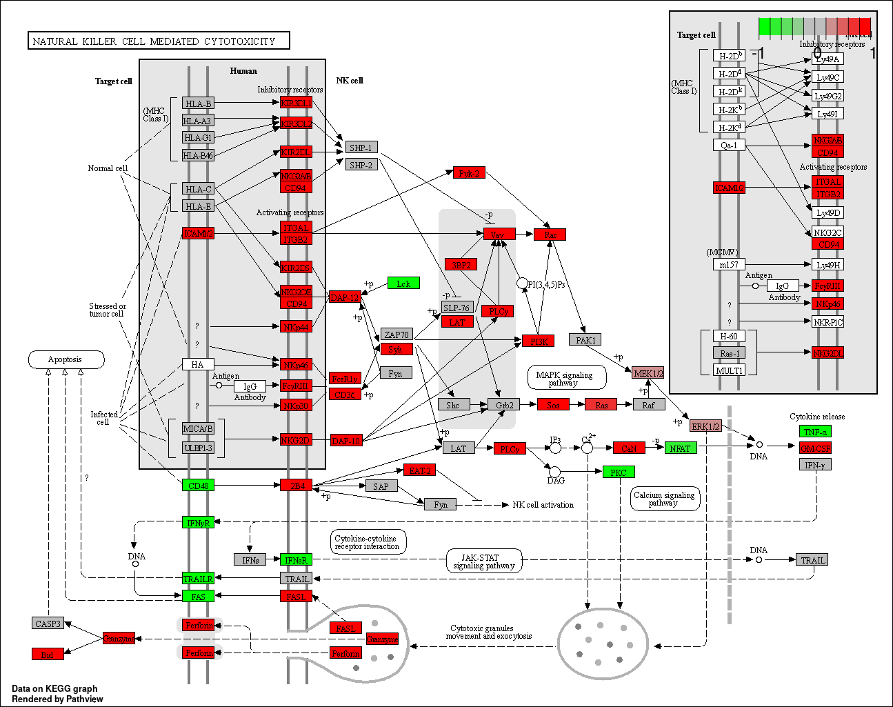
Once you have performed a GSEA of the KEGG pathways, it is possible to overlay the fold change values of your genes on top of the KEGG pathway maps available online. For this, create a named vector of fold change values, where the non-significant genes will be grey, while the up- and down- regulated genes will be colored in the KEGG pathway map. The pathview() function comes from the pathview package (surprisingly…)
library(pathview)

# pathview map with non-significant genes in grey:
# set log fold change of non-significant genes to 0:
NK_vs_Th$logFC_0<-ifelse(NK_vs_Th$p.adj>0.05, 0, NK_vs_Th$logFC)

# create named vector of fold change values:
genePW<-NK_vs_Th$logFC_0
names(genePW)<-NK_vs_Th$symbol

# Create pathview map for Ribosome = hsa03010
pathview(gene.data  = genePW,
         pathway.id = "hsa03010",
         species    = "hsa",
         gene.idtype = "SYMBOL")

# Create pathview map of Natural killer cell mediated cytotoxicity = hsa04650
pathview(gene.data  = genePW,
         pathway.id = "hsa04650",
         species    = "hsa",
         gene.idtype = "SYMBOL")
Very often, researchers have their own gene sets in mind, either that they compiled from the literature, or that they defined from previous experiments. If this is the case for your experiment, you can generate an Excel file that contains one gene set per row, the 2 first columns contain the gene set ID and the gene set description, and the genes that belong to each gene set are listed in the next columns. To have an idea of the structure of this file, open the .gmt file that we provided using Excel or a Text editor (NotePad, TextWrangler, BBEdit, etc).
In this exercise, we will perform a GSEA of the 50 hallmark gene sets that can be downloaded from MSigDB, which we can import using clusterProfiler::read.gmt().
Alternatively, we can import the Hallmark gene sets using msigdbr. What is the format of the object that is created? Use the GSEA() function, by providing the named and sorted
vector of t-statistics we used above with gseGO(). Why do we use this one and not the one created for gseKEGG()?
# Import hallmark, convert to term2gene and run GSEA:
term2gene_h <- msigdbr(species = "Homo sapiens", collection = "H")
# Or alternatively:
# term2gene_h<-read.gmt("h.all.v2023.2.Hs.symbols.gmt")

head(term2gene_h)
length(unique(term2gene_h$gs_name)) # 50

# Run GSEA with the function that allows to use custom gene sets,
# provide the named vector of t statistics
h_NK_vs_Th<-GSEA(gl, TERM2GENE = term2gene_h[,c("gs_name", "gene_symbol")],
                 eps=0,
                 seed=T)

View(h_NK_vs_Th@result)

# Number of significant gene sets:
length(which(h_NK_vs_Th@result$p.adjust<=0.05))
Finally, we can easily visualize the results:
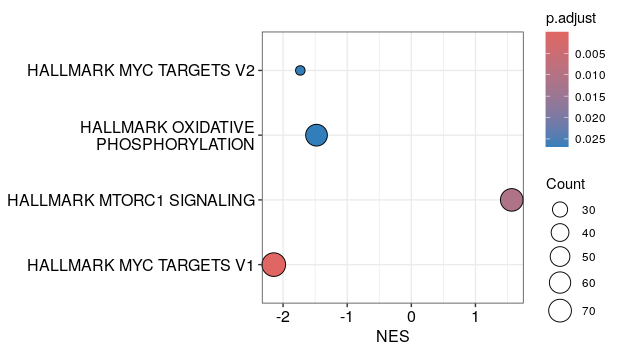
# A dotplot with geneRatio or NES on the x-axis:
dotplot(h_NK_vs_Th)
dotplot(h_NK_vs_Th, x="NES", orderBy="p.adjust")
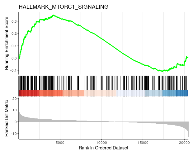
# A barcode plot:
gseaplot2(h_NK_vs_Th, geneSetID = "HALLMARK_MTORC1_SIGNALING",
title="HALLMARK_MTORC1_SIGNALING")
Feedback
Thanks for attending this course! Don’t forget to give honest feedback via the link sent by the course organizer.
Extra exercise for ECTS credits
- Perform GSEA of the NK vs Th data using the Reactome gene sets either downloaded using the
msigdbrpackege or downloaded from the MSigDB website here. - How many gene sets are significantly enriched?
- Generate a barplot of the NES of all significant gene sets, with the bars ordered according to NES value.
- Generate a barcode plot (i.e. gsea plot) for the gene set with the lowest NES.
Steps
- Import the reactome gene sets using
msigdbr()with argumentscollection="C2"andsubcollection="CP:REACTOME", or import from the provided filec2.cp.reactome.v2023.1.Hs.symbols.gmtusingread.gmt(). - Use the
GSEA()function providing a sorted named vector of t-statistics and the reactome gene sets, and use argumentminGSSize=30. - Count the number of significant adjusted p-values.
- Use
barplot()andgseaplot()for the visualization of the results.